There isn’t a real “forbidden palette” after 50—what matters more is skin undertone, contrast, and how a color interacts with your natural brightness. That said, some shades tend to drain warmth or make skin look tired more easily if they’re worn close to the face or used without balance.
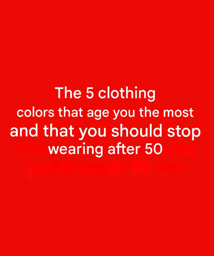
Here are 5 colors that often do that—and what to consider instead:
1. Harsh, high-intensity neon colors
Neons like electric lime, hot pink, or acid yellow can overpower natural facial features and highlight uneven tone or fine lines. They tend to reflect strongly onto the skin, which can create a washed-out or overly stark effect.
Better option: softened versions like coral, dusty rose, or muted teal.
2. Ashy or dull beige (especially near the face)
Beige sounds safe, but very flat or grayish-beige can blend into the skin and remove definition, making the face look tired or pale.
Better option: warm beige, camel, or cream with a slight golden undertone.
3. Muddy brown tones
Brown isn’t the problem—it’s the muddy, low-saturation browns that lack warmth or clarity. These can drag down the complexion and reduce visual “lift.”
Better option: rich chocolate, caramel, or warm mocha shades.
4. Cool, icy pastels (like icy blue or lavender)
Very cool, chalky pastels can emphasize under-eye shadows or create a bluish cast on the skin, especially if your undertone leans warm or neutral-warm.
Better option: softened warm pastels like peach, apricot, or warm lilac.
5. Stark jet black (when worn close to the face)
Black is classic, but pure jet black can create high contrast that sometimes sharpens facial lines or emphasizes tiredness—especially without makeup or accessories to soften it.
Better option: soft black, charcoal, deep navy, or espresso brown.
A more useful rule than “avoid colors”
Instead of age-based color rules, stylists usually focus on:
- Undertone harmony (warm vs cool)
- Contrast balance (how strong the color is vs your skin/hair)
- Placement (face vs lower body matters a lot)
A color that “dulls” one person can make another look radiant depending on these factors.
If you want, I can suggest a palette specifically based on your skin undertone (warm, cool, or neutral) and hair color—it’s much more accurate than age-based rules.
