That headline is more style clickbait than real advice. There are no “forbidden colors after 50” that will automatically dull your glow. What actually matters is contrast, skin undertone, fabric, and fit—not age.
That said, some colors can make certain skin tones look more washed out if they’re the wrong shade for you, and that’s probably what these posts are trying to exaggerate.
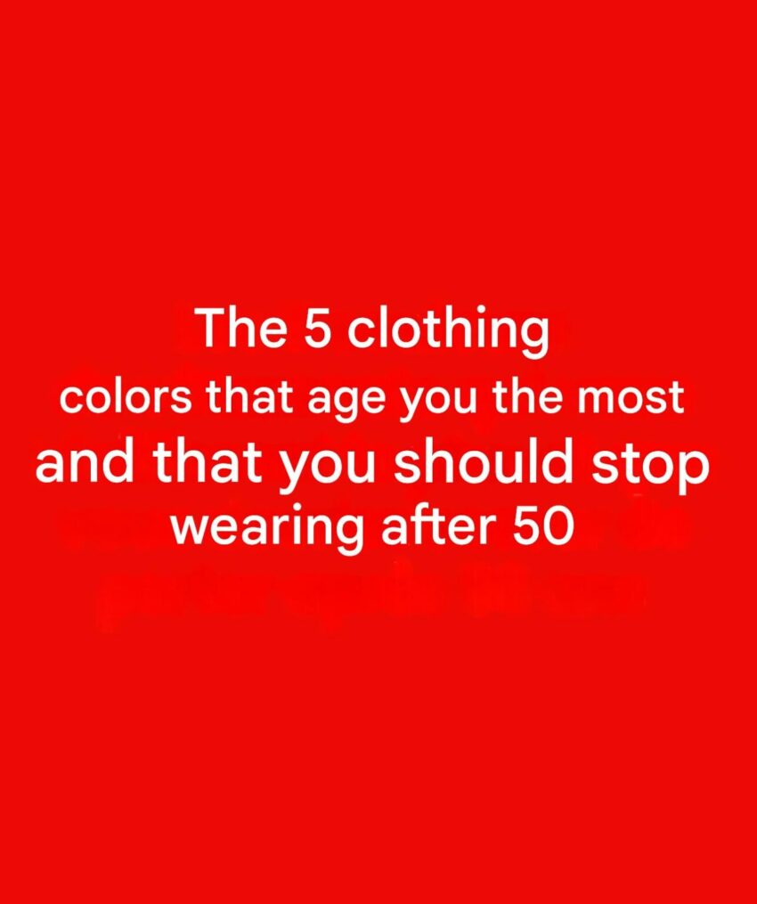
🎨 “5 colors to be careful with” (not avoid) after 50
1. Washed-out beige / nude tones
- Can blend into the skin and look dull
- Better: choose warmer beige, camel, or add contrast with accessories
2. Grey that matches your skin tone too closely
- Can make the face look less defined
- Better: charcoal, deep grey, or add color near the face
3. Pale yellow
- Can highlight sallowness in some skin tones
- Better: mustard, gold, or richer warm yellows
4. Ashy pastels (very light, muted pinks or blues)
- Can look “flat” if there’s not enough contrast
- Better: slightly richer or jewel-toned versions
5. Stark neon shades (on most people)
- Can overpower natural coloring
- Better: toned-down versions (coral instead of neon orange, soft cobalt instead of electric blue)
🧠 The real secret (fashion experts agree)
Instead of age, focus on:
- skin undertone (warm, cool, neutral)
- contrast with hair/eyes/skin
- fabric quality (matte vs shiny)
- fit and structure
A great color in the wrong shade can look bad at any age.
💡 Bottom line
No color is “off-limits after 50.” The goal is choosing shades that complement your natural coloring and bring contrast and brightness to your face.
If you want, I can suggest a personal color palette (warm vs cool tones) so you know exactly which colors make you look more vibrant.
