🥕 What’s working well
🎯 1. Clear concept
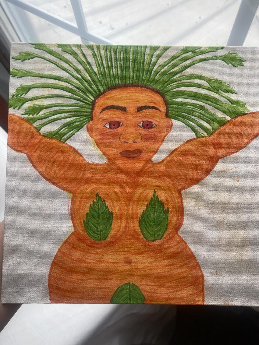
You immediately read her as a plant/vegetable hybrid character. The carrot-orange body + green leaf hair + leaf accents on the body communicates the idea clearly.
🌱 2. Nice motif consistency
Repeating leaf shapes (hair, chest, belly) helps unify the design. That’s good visual language.
🎨 3. Warm color identity
The orange + green palette is cohesive and fits the “carrot” theme well.
⚠️ Areas to improve
🧍♀️ 1. Anatomy feels unclear in torso/arms
Right now:
- The arms are very symmetrical and flat
- The torso shape reads more like stacked circles than a body
👉 Suggestion:
- Define shoulder structure more (even stylized)
- Add subtle asymmetry in arms/pose for life
- Clarify where chest → waist transitions happen
🥕 2. Leaf placement needs stronger purpose
The leaf shapes on the chest and belly feel decorative but not fully integrated.
👉 Suggestion:
- Make them feel like they’re growing from the body, not stuck on top
- Vary size/angle slightly so they don’t feel stamped
- Consider veins or directional flow matching body curvature
🌿 3. Hair/leaf crown could be more dynamic
The green “hair” radiates evenly like spikes.
👉 Suggestion:
- Introduce variation in length/thickness
- Let some strands overlap or bend differently
- Add a focal direction (wind, tilt, gravity)
👁️ 4. Facial expression is neutral but slightly disconnected
The face is calm, but:
- Eyes feel slightly flat in emotional focus
- Brows are strong but don’t fully match expression energy
👉 Suggestion:
- Decide her personality: calm? mischievous? powerful?
- Adjust eyes + brows to match that tone more clearly
🧱 5. Value structure (light/shadow)
Right now the figure is mostly mid-tone orange.
👉 Suggestion:
- Push darker shadows under arms, neck, belly curves
- Add a stronger light direction so she “pops” from background
- This will help a LOT when you add scenery behind her
🌄 Background considerations (before you start it)
Since she’s already very warm-toned:
- Use cooler or muted background colors (soft greens, blues, desaturated earth tones)
- Avoid competing bright greens behind her hair
- Consider framing her as a “garden spirit” or “harvest figure” with organic shapes
🧠 Overall impression
This feels like a strong character concept illustration in progress, not a finished piece yet—but the foundation is solid. The biggest gains will come from:
- stronger anatomy definition
- clearer light/shadow structure
- making the plant elements feel “grown-in” rather than placed on
If you want, I can sketch out (in words or layout ideas) 3 background directions that would make her look way more powerful visually—like “sunlit greenhouse spirit,” “rooted earth goddess,” or “fantasy vegetable guardian.”
